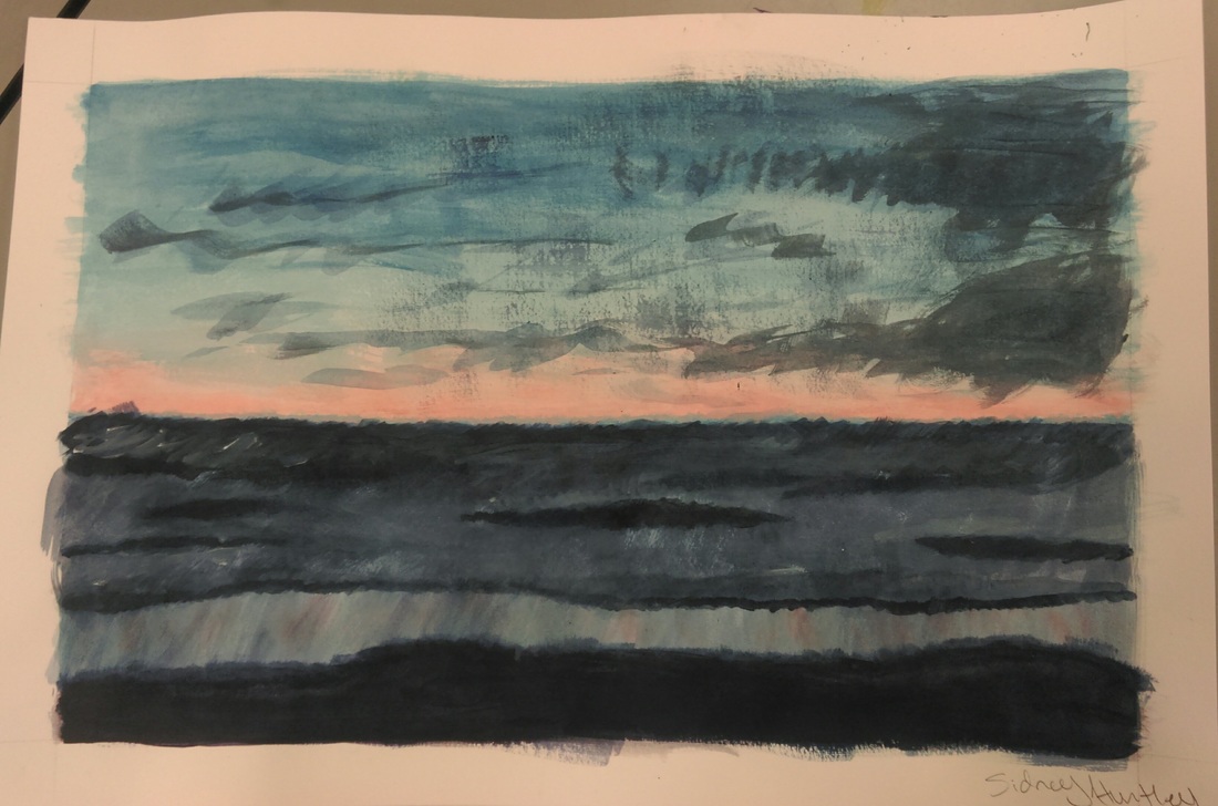
 This painting is supposed to be a landscape of the beach at sunset. The media was paper and acrylic paint. A new skill that I learned was how to blend acrylic paint in order to make the painting look fluid and not choppy. Some of the main art elements are that the sky has nice color, also the values of the colors go from lighter to darker within the drawing in many areas. Also, I think that darkness of the clouds and sea puts and emphasis on on sky and the colorfulness of it. To me this drawing gives of a very calming and soothing feeling.
0 Comments
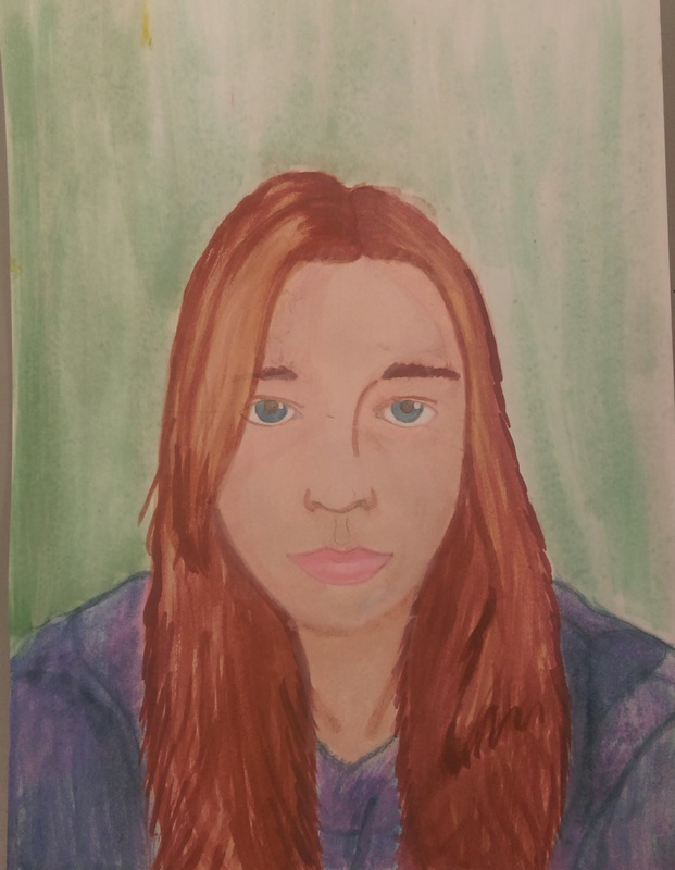 For this assignment I attempted to create a portrait of myself. The Media of this painting was paper and water color. During this assignment I learned not only how to draw a face proportionally, but paint in a way that gives the face dimension and a realistic feel. I feel like I was able to portray good texture for the hair. Also, I feel like I was able to give my painting sufficient shading in the face. By painting the sweatshirt multiple colors its have it more of a shae rather than one color giving it a slat feel. I also gave the divots in the sweatshirt darker values to make it seem more real. The way I painted this gave my expression a very soft feel.
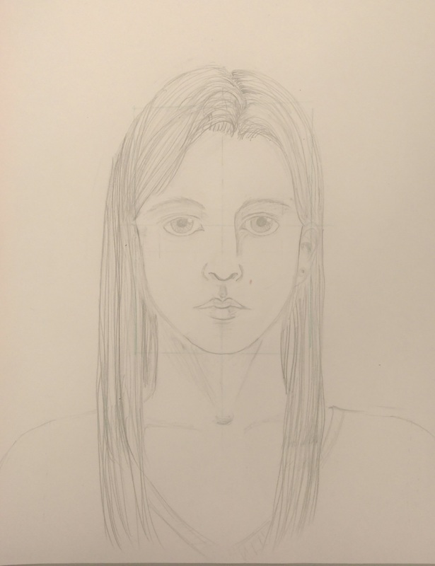 I feel like my attempt at a self portrait looks similar to me. The media was paper and pencil. During this assignment I learned how to properly proportion a face to were it looks like a person and not an alien. I also learned how to draw a nose and lips, I had never known the technique for drawing them. By using lots of lines varying in value I was able to create realistic looking hair. Also, proportionally the facial features of this drawing look correct, everything is in the right place. Furthermore, the scale of the eyes to the nose to the lips also looks correct. I feel like from the face I was making and how I drew it the portrait gives of a stoic feeling.
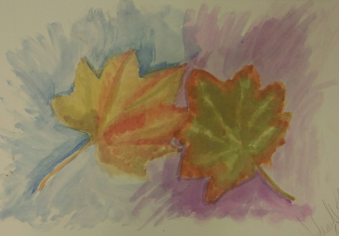 This image is obviously a painting of a leaf, and the media that was used was water color paints and paper. A new skill that I learned was how to paint in layers, and how to not ever paint the paper to were it looks muddy. In this painting there was many colors used to create real life leaf colors. Also, the value of the background, by not consistently being dark it creates a nice feeling of gentle movement. Also, by using contrasting colors made the leaves pop. The overall feeling you get from this painting is a very soft and gentle one. It gives off a very calm mood
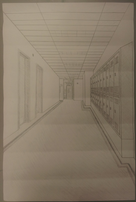 To me this image looks very close to what the actual hallway looks like. I feel that it is indeed very recognizable. The medium of this drawing was pencil and paper. A new skill that I learned while I was drawing this was that by shading and adding more objects within that drawing you created more depth and gave it a more realistic feel. Also by really focusing on the shape of the whole picture and which shaped goes where and by trying to match everything it put an emphasis on the reality of this drawing. It really feels like you could just step forward and walk down this hallway, the movement of this drawing is very realistic and convincing. The proportion is also very close to how the hallway actually looks so that also contributes to the real feeling of the drawing.
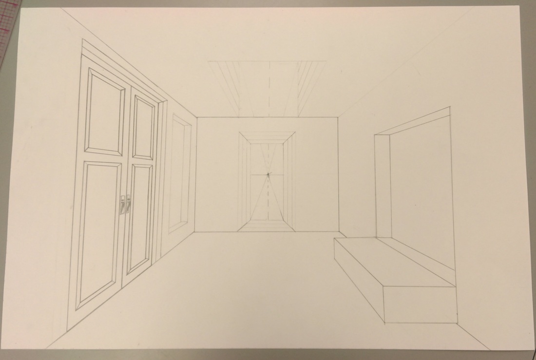 what this drawing looks like is fairly obvious, it is indeed a drawing of a room. The media was pencil and paper. During drawing this piece I learned that by darkening and lightening values it made objects stand out more so than the lighter ones. Also I learned that adding more objects in the drawing gave the drawing more dimension and depth. I feel that the lighter and darker values puts emphasis on specific elements of this drawing. To me this drawing seems to gave a mystical feel, like all the doors could be leading to somewhere else entirely.
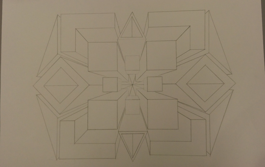 In this assignment we used one point to create a vanishing point within our drawings. The medium that was used was pencil and paper. To me this drawing looks like a vortex that just keeps going deeper into the page for eternity. A new skill I learned while I was drawing this was how to create depth with orthogonal lines and a vanishing point. Also, how to use shapes and space to create interesting depth that was aesthetically pleasing. The feeling that this drawing gives off is a very trippy enthralling feeling, it makes you want to just keep looking at it.
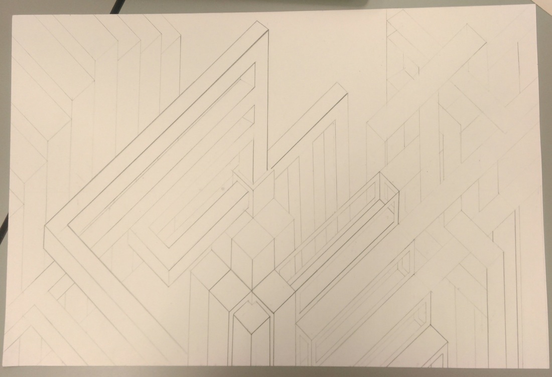 In this drawing this image looks like a city with a bunch of intertwining walk ways going through it. The media of this assignment is pencil and paper. A new skill I learned from this project was how to make dimension and depth with parallel lines on the scale that was required. By using lines this way one created movement, and by making the lines different values it put an emphasis on the shapes that were closer rather than the ones that were in the back. When I look at this drawing it feels very futuristic and in some ways it may even feel cold because it feels so modern.
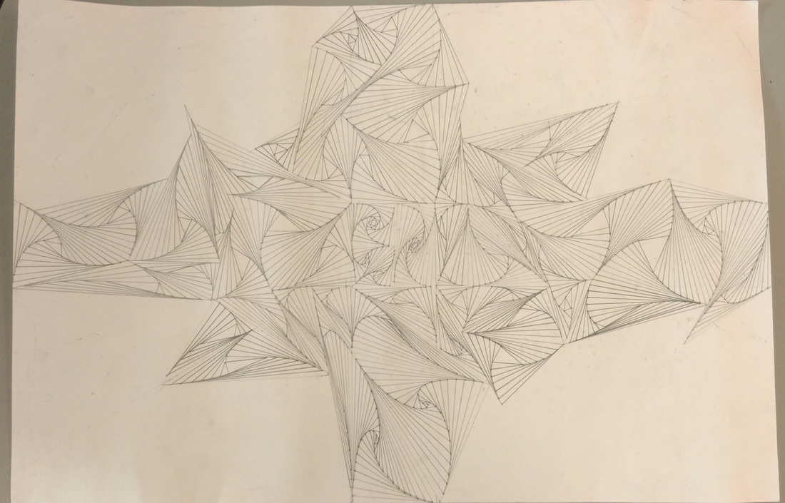 This drawing I have created overall gives a sense of elegance, the way that the shapes make very smooth movements reminds me of flower petals and wind. The media is paper and pencil. By changing the value of the lines throughout the piece it gave some places more depth, putting and emphasis on the movement throughout it. Mainly using triangles and by lining up the dots and going opposite ways from the middle line it unified the individual shapes within the drawing. During drawing this I did not stick with a specific pattern and by doing so it gave the movement a carefree feeling. Proportionally I feel that when you look at the piece it seems fairly balanced. There is one side that is a little more heavy than the other but I feel that that contributes to this kind of flowing feeling you get. The skill I learned from this project was how to use linear lines in order to makes movement.
|
AuthorWrite something about yourself. No need to be fancy, just an overview. Archives
December 2016
Categories |
 RSS Feed
