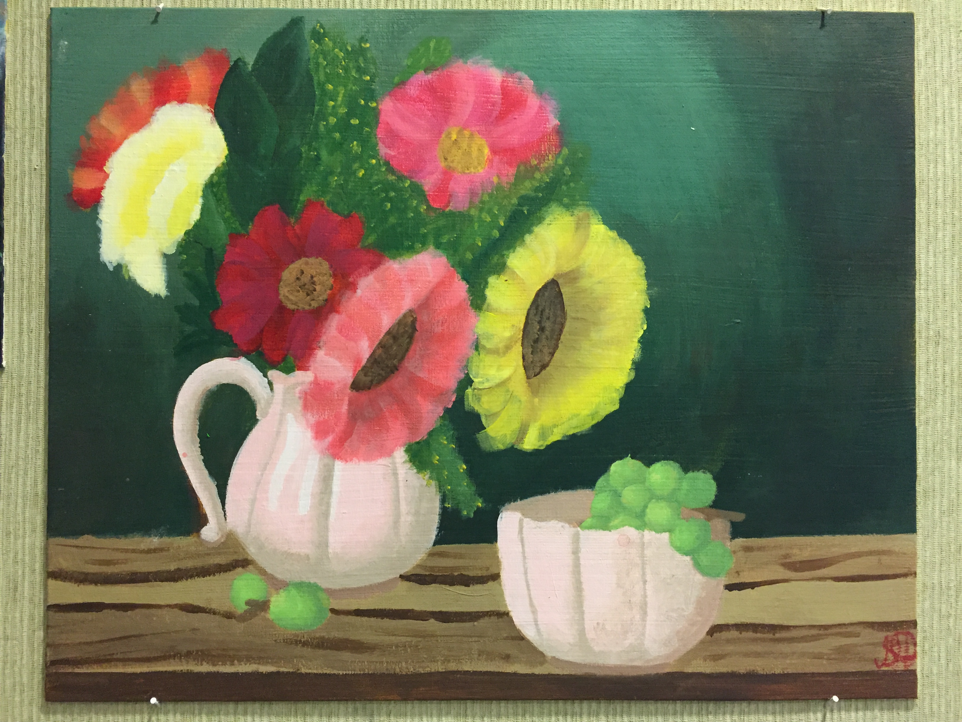
 This painting is one of a photo I found online, the medium was acrilyc paint and canvus. One skill I perfected was how to paint and not have my painting look like a blod of color. I also learved how to you the brush shape to my benefit. One element I really worked on in this painting was color. I really tried to make it look like the photo I had. I feel like because of what i was focusing on this picture it came out with a really emphasised sense of color and realness. Due to me reallu focusing on color, brush strokes, and matching my photo proportionally, I was able to create the best painting i've done.
0 Comments
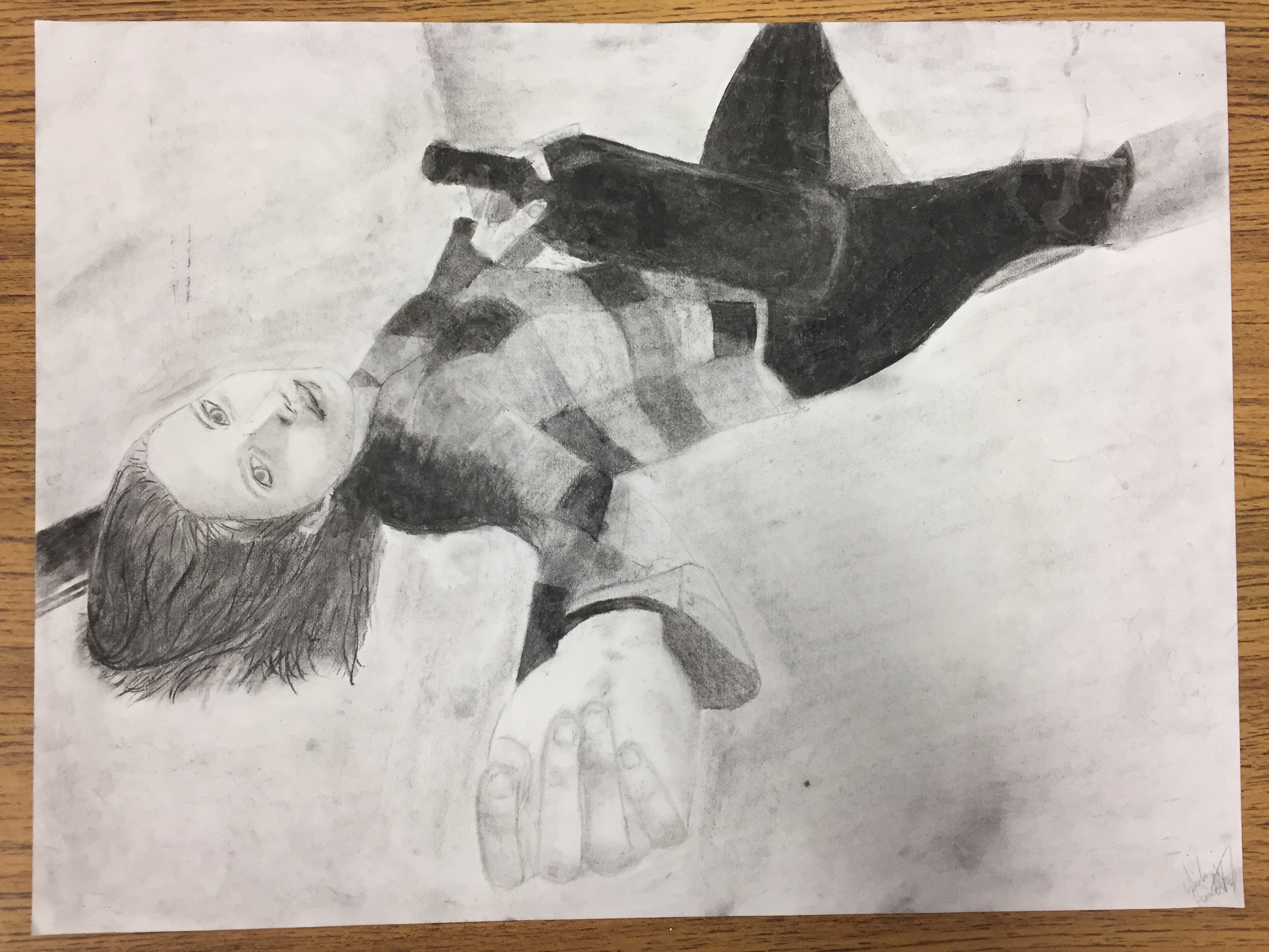 The medium for this project was charcoal and paper. One thing I improved upon in this drawing was my proportions. One element I really worked on was value, making a distinction between the values instead of the drawing looking like a giant blob. By using these skills i was bale to make the most proportionally correct drawing of a person I have ever done.
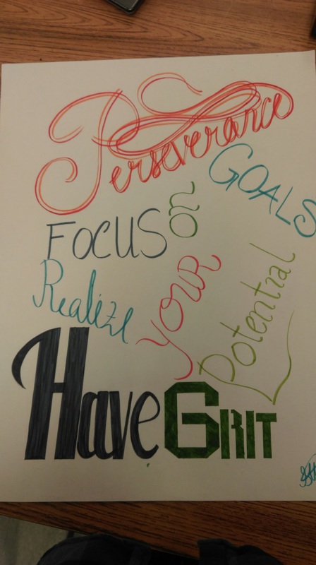 For this project my medium was paper and Aqua Brushes, In this project I demonstrativeness by using various fonts throughout the project. Making so there was line variance as far as thickness, thinness, and flow went. The things I like about this piece are probably the top and bottom parts because they stand out they stand out the most and look the neatest. One thing I can improve on next time is maybe time management and not taking too much time on one part of the piece, not leaving enough time for the other parts.
 For this project I was inspired by Doctor Woo and his geometric minimalist tattoos. Some elements in this project is that the individual pieces within the drawing harmonize with each other, and the contrasting 2D and 3D elements make for an interesting image. One thing I reinforced was how to design something so that all the images flow together.
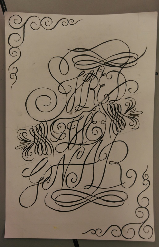 For my first choice project I choose to make a calligraphy topography. Some elements of this drawing would be line (obviously) and the shapely flowing lines. Also, throughout this project there is nice movement between the lines and the lines also harmonize with each other. In this project I learned how to be patient with drawing and also how to hold my hand more steadily. The main thing I take away from this project was that calligraphy is very hard and you don't understand how much your hand shakes until you try to draw a straight line with an ink pen.
In this drawing I did a snowmobile shirt with my name and some numbers on the back. I learned what a screen print was and how to do it. One element of this shirt would be that unity because the back pieces are very symmetrical and then the front pieces are lined up in the center. Also by using the same col ors on the front and the back it brought the shirt together. With the new skills I learned I was able to create a customized shirt that really fits me and what I like. I have a unique shirt that no one else has, that also has my name on it. :)
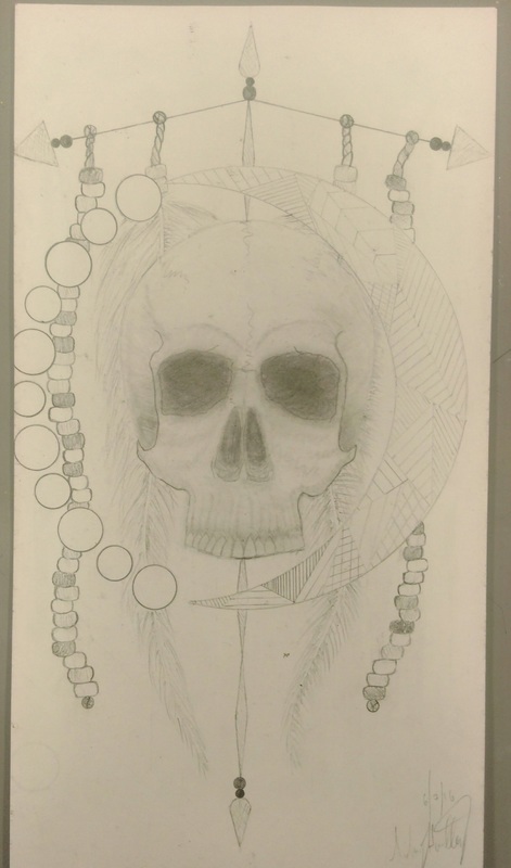
My block print is of a sugar skull with a crazy line background. One new skill I learned was what a reduction print was and how to do it. I think one of the elements most emphasized it probably lines, because of the contrasting lines it really makes the actual skull stand out, it also gives the print some depth. With my new skills learned I was able to create a really cool print that included layers of color rather than one layer of one color or two colors. This made my print more vibrant.
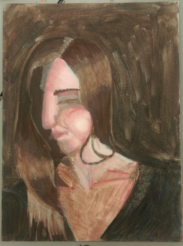 This is a self portrait painting so it has the likeness of me. A skill I learned was the glazing technique, how you layer paint to create a portrait. I think proportion was most emphasized, it features of this face are proportional to the ones on my face. With this, I was able to create a face that in likeness, did in fact look like me and not come other person.
For this project I set up a still-life using shapes to create shadows and variation of values. It doesn't necessarily look like like anything else. One new skill that I learned was how to create different values using water color paints. This painting has good values within it as well as proportion. Something new I was able to create was, even when using different colors, I was able to have the values in each painting match up correctly.
|
AuthorWrite something about yourself. No need to be fancy, just an overview. Archives
December 2016
Categories |
 RSS Feed
