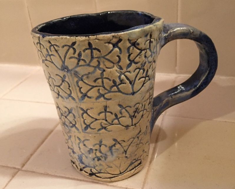
 For this project I tried to create a cup. The media for this project was a soft slab piece of clay. One new skill that I learned the importance of evenly applied glaze. This project's glaze was a little lacking, in some areas there was too little of glaze and too much in others which caused it to pull away in some areas leaving bare spots. Some of the art elements in this project that stand out, were the blue color I applied by dipping, then wiping all the access off so that it was just in the crevasses. The blue does stand out against the white really well, I will definitely try this glaze pairing again This project gives me sort of a Victorian era feel, probably due to the color choices and the pattern on the cup. If I could go back and change one thing, it would be the glaze, and I would apply it more evenly so that the finished product looked better.
0 Comments
Leave a Reply. |
AuthorWrite something about yourself. No need to be fancy, just an overview. Archives
May 2017
Categories |
 RSS Feed
